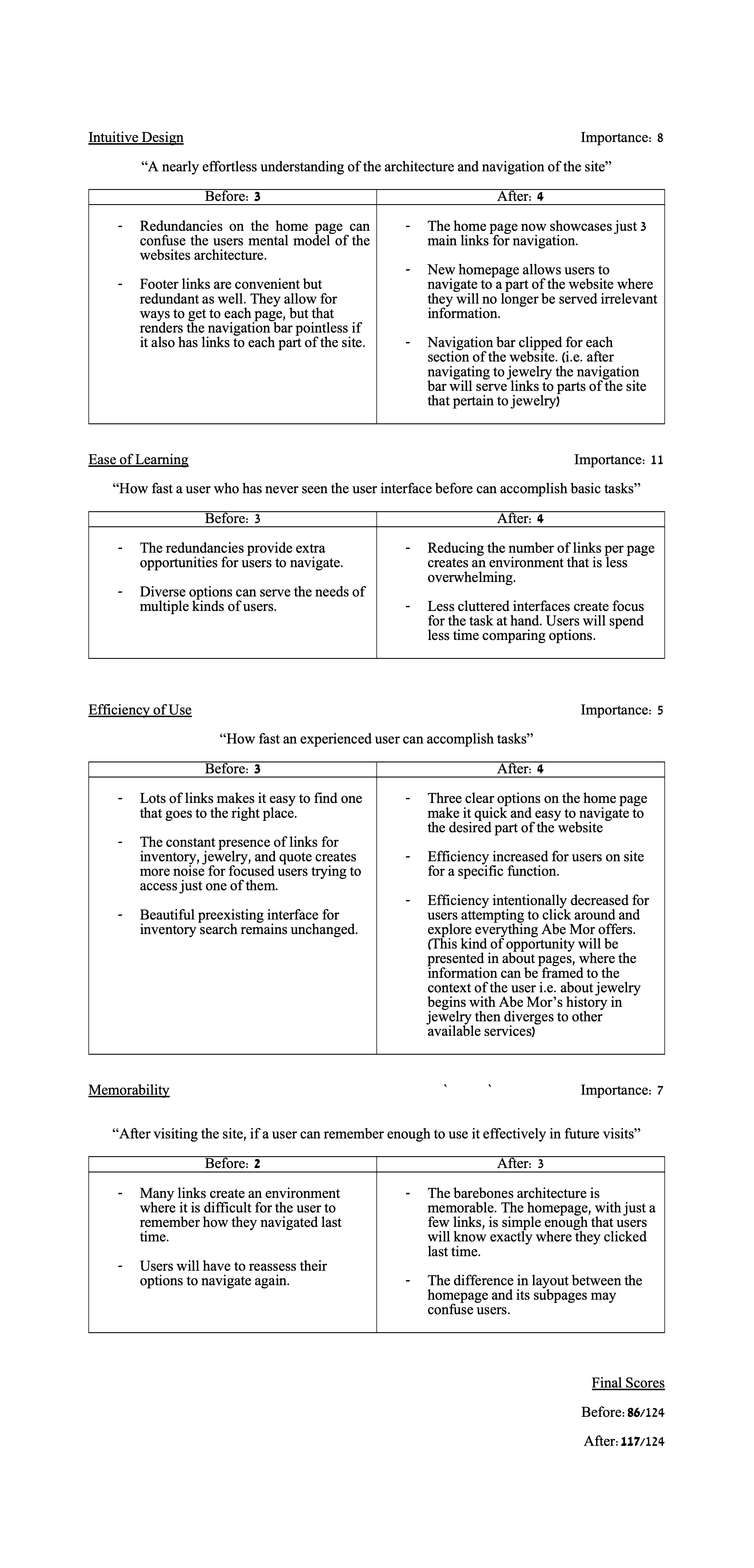


The original website bottlenecks its efficacy by attempting to serve both of its visiting populations–consumers and businesses–at the same time. Since separating the two populations would be detrimental to creating a cohesive experience for someone exploring the two, the problem is solved by reorganizing the structure of the site. The reorganization is inspired by the realization that there are only 3 distinct actions users may be looking to take on the website: searching the inventory, requesting a quote for a piece, and browsing jewelry. With simple options, I decided they would be best interfaced plainly and directly, all available on the homepage.

To evaluate the edits I have made, I am using a weighted average measurement to judge the usability before and after my redesign. The categories and definitions are outlined in https://www.usability.gov/what-and-why/usability-evaluation.html. Each category gets a one-to-four rating, 1 being the worst, 2 not so good, 3 good, and 4 excellent. I then rate how important each category is for Abe Mor, to create the weights for the average. Note: the scale for the category rating is of arbitrary degree because all that matters is their relative values which represent degrees of priority.
